
Valley Sawmills is one of Somerset’s few remaining traditional sawmills, at Holwell near Frome. They needed a brand, a website and an online shop, all ready for the Frome Show. The logo came first, because everything else hangs off it.
This is how it came to life, step by step, including the ideas that didn’t make it. If you’re thinking about a new logo for your own business, it’s the same process I’d take you through.
One: start with the yard
Valley is a working yard: logs, saws, sawdust and people who know their timber. Trade and retail customers pay the same straight price. A logo can’t give a business a personality it doesn’t have, so the job was to find one that looked like it belonged in that yard.
Two: go wide before you narrow down
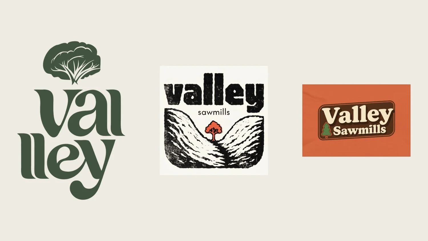
The first deck I sent Valley had 3 routes and 38 versions in all.
- Serif fonts. Playful and retro-modern, with different levels of detail.
- Lino print texture. Clean and dirty at the same time. Modern and traditional in one logo, so you think ‘maker’ at first glance.
- Bring back the 70s. Joyful badge logos with the texture baked in, colourful and a little disruptive.
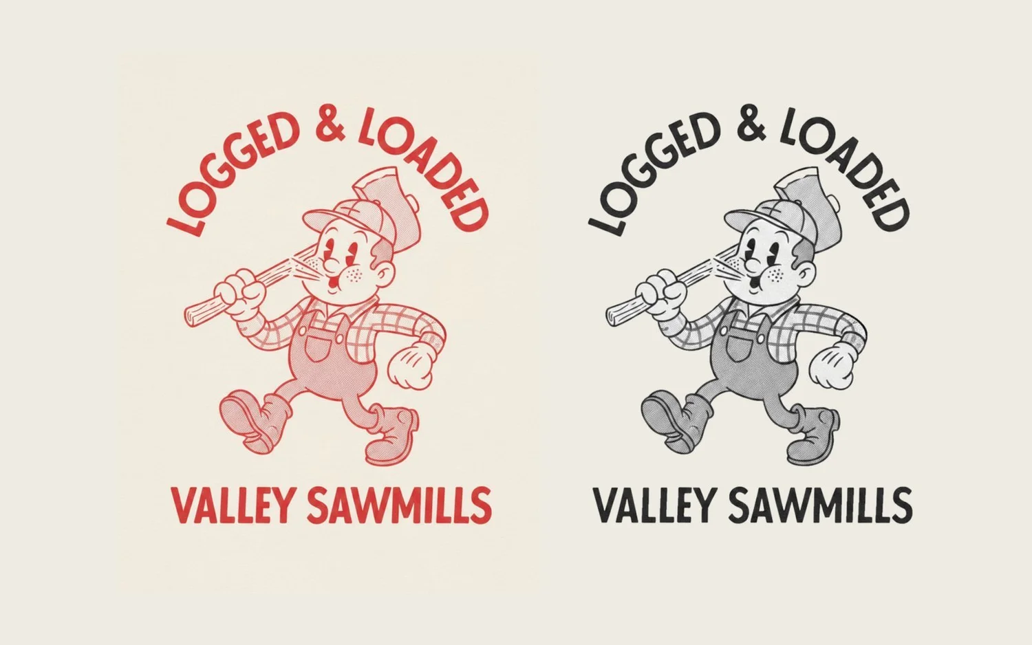
There was also one 1950s throwback, a cartoon lumberjack called Logged & Loaded, purely for fun.
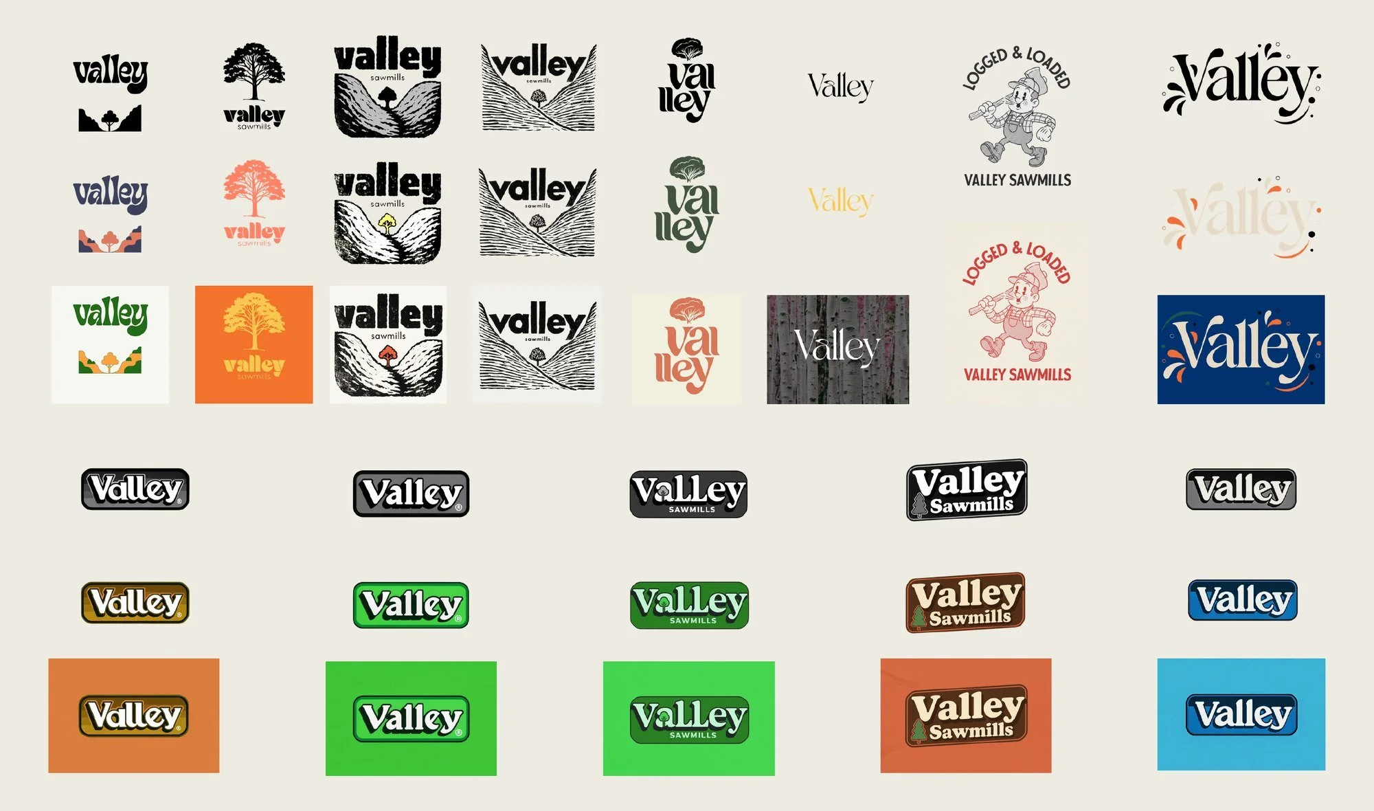
Going wide is cheap at this stage. A sketch costs minutes. Changing a logo once it’s on signs, vans and packaging costs a great deal more.
Every concept was drawn as an SVG vector, so any of them could go up on a billboard or shrink to a profile picture without going blurry.
Three: show it where it will live
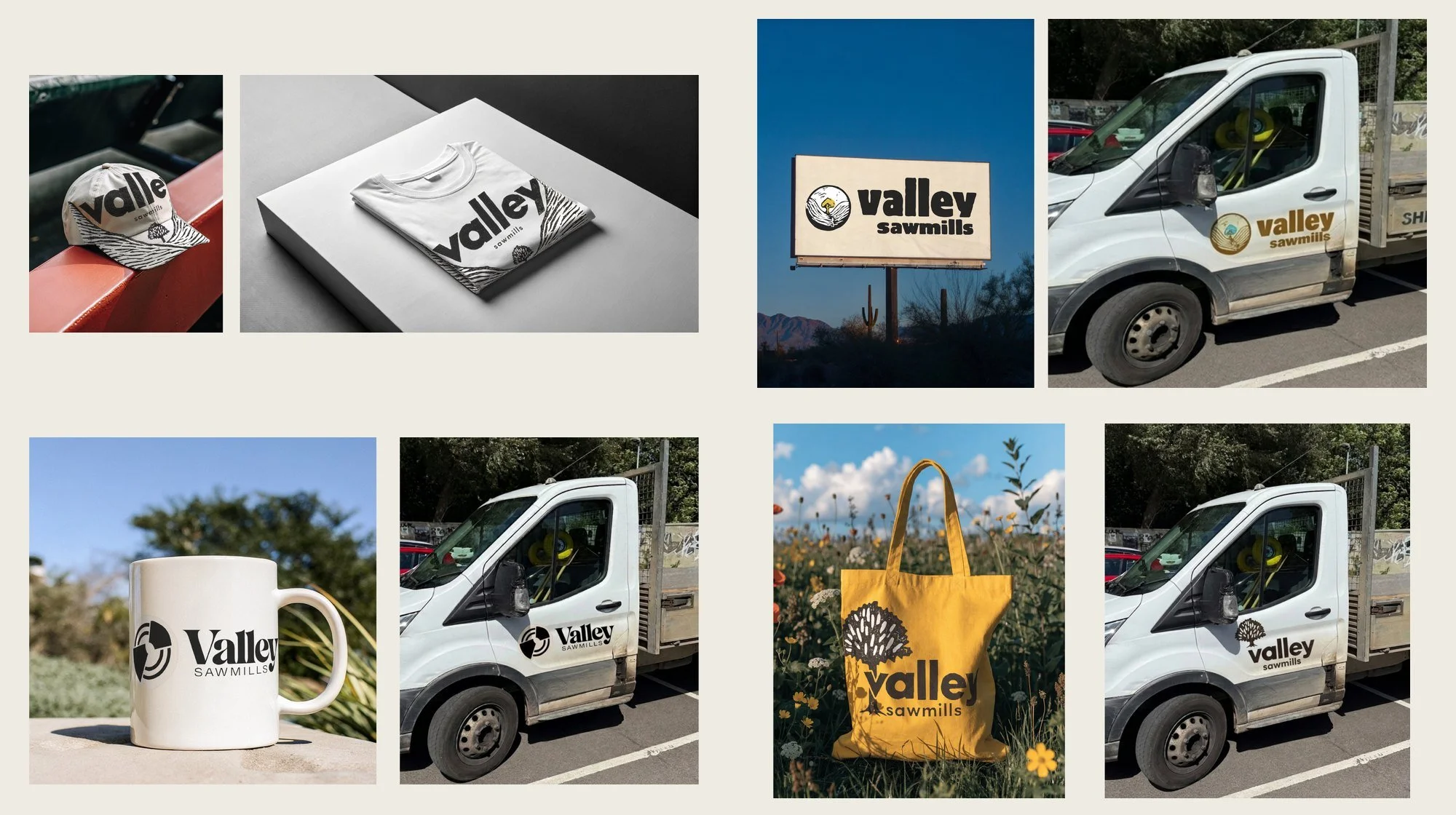
A logo on a white page tells you very little. So the ideas went onto caps, t-shirts, a van, a billboard, a mug and a tote bag. You find out whether a logo works when you see it on a van door from across a car park.
Four: listen, then evolve
The first deck said plainly that these were flavours of how the brand could look, and that some were rougher round the edges than others. Valley’s feedback went into a second round of evolutions.
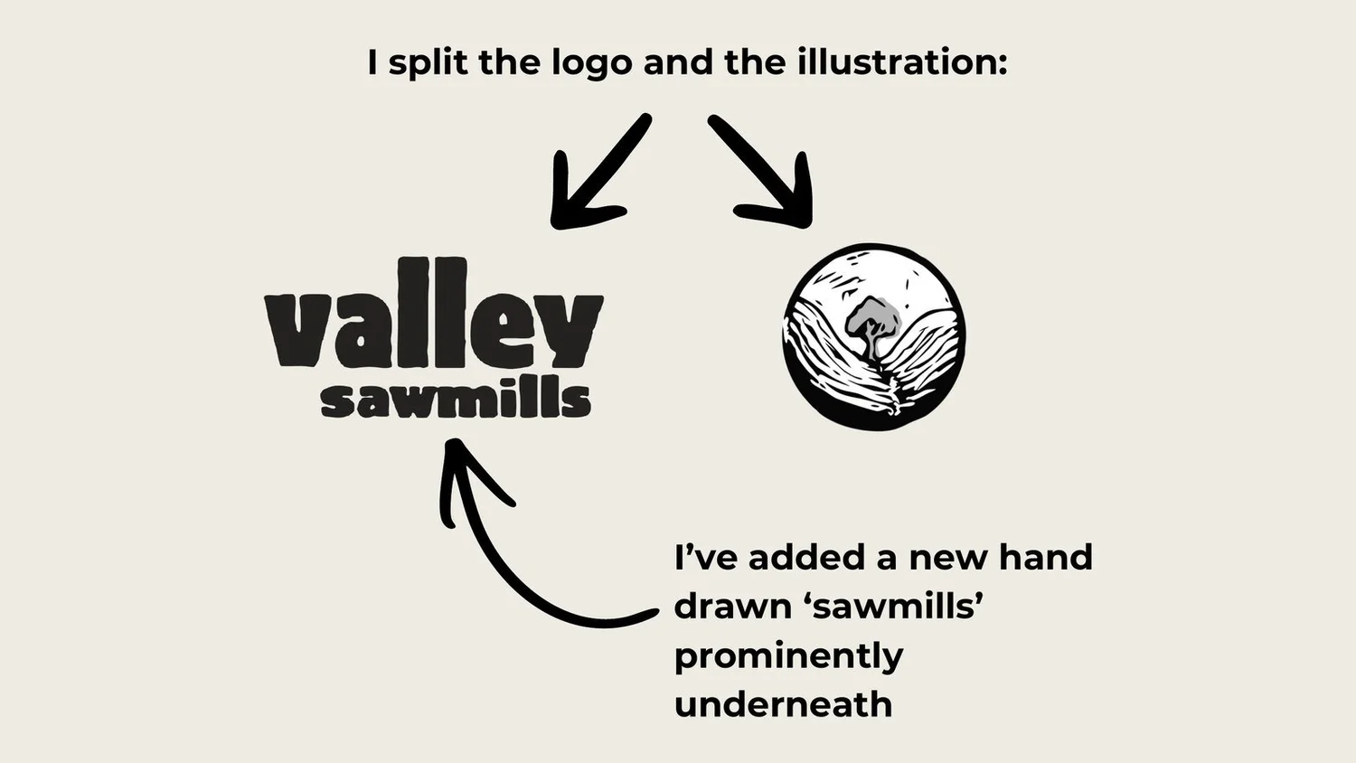
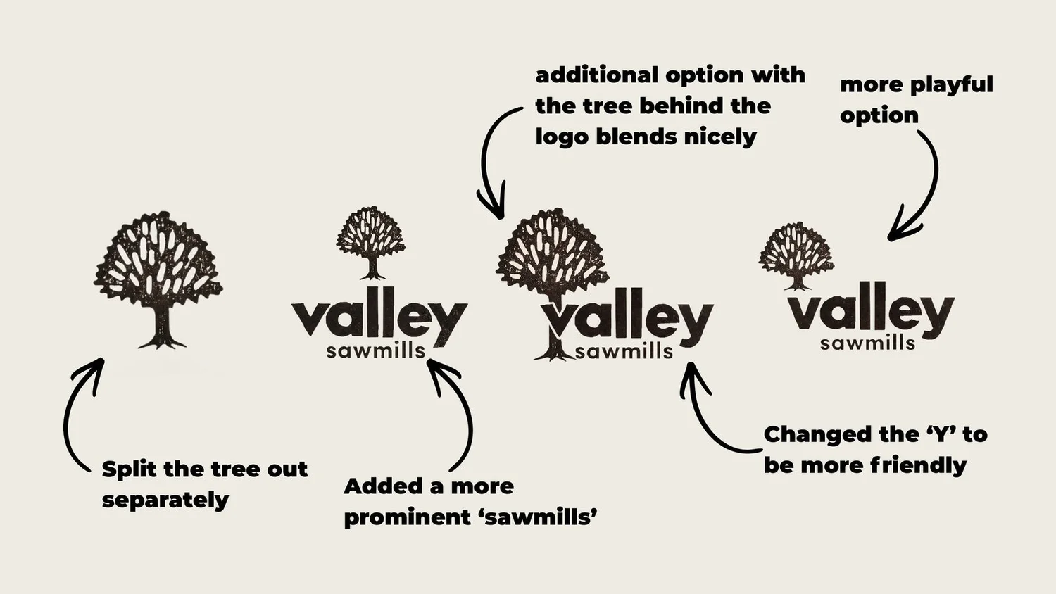
- I split the lino logo from its illustration, so the wordmark and the artwork could work alone or together.
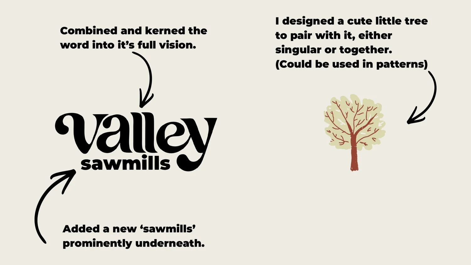
- I hand-drew a new, more prominent ‘sawmills’ to sit underneath.
- I drew a little tree to pair with the wordmark, on its own or as a pattern.
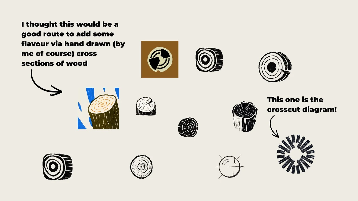
- I hand-drew cross sections of wood as another graphic device.
- I made the ‘y’ friendlier.
Five: strip it back
The logo Valley uses today is the wordmark on its own: ‘valley’ in heavy hand-drawn letters, ‘sawmills’ underneath, one colour and no frame. The tree, the texture and the badges all helped show what the brand should feel like. The finished logo only has to carry the name.
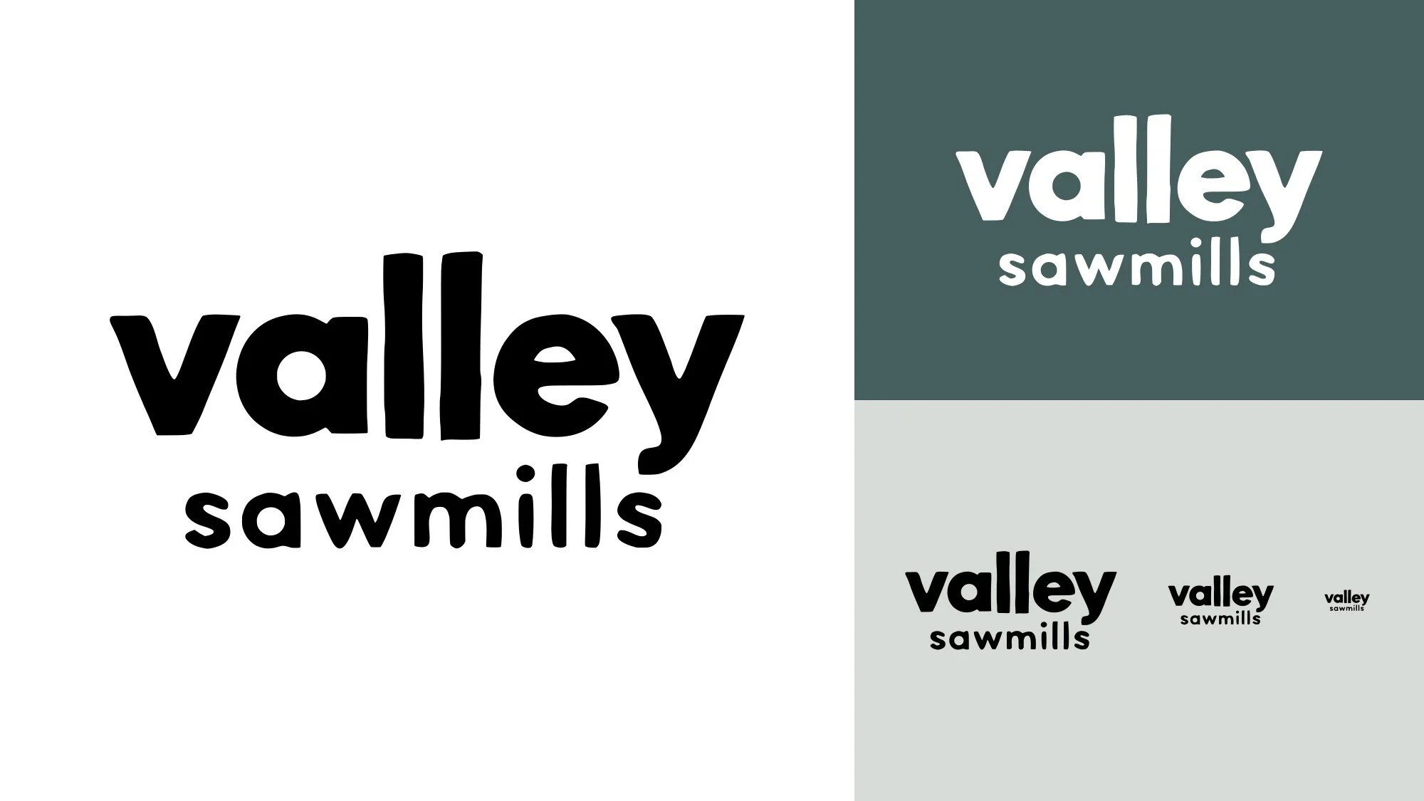
Fewer parts make a logo more useful. One colour means it can be printed, embroidered, engraved or stencilled without losing anything. It still reads at the size of a browser tab, which is exactly where you’ll find it on the Valley website.
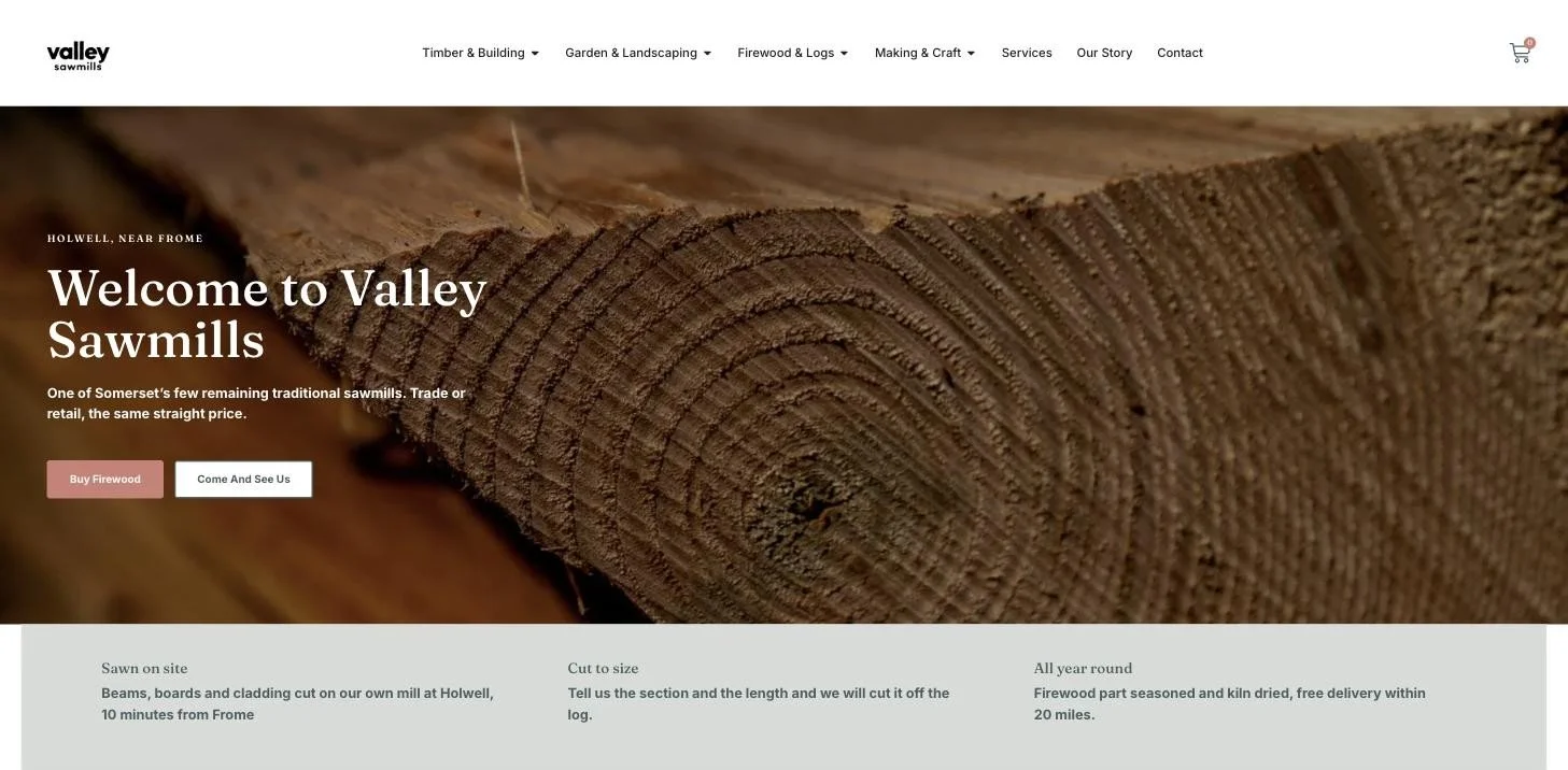
Six: build the toolkit around it
With the logo agreed, I built the rest of the identity around it: an earthy green-grey as the lead colour, dusty rose and burnt orange as accents, Fraunces for headlines and Inter for everything else. The website, the shop, the photography and the brand film all follow the same rules.
What this means for your logo
If you’re planning a new logo, here’s the short version. Go wide before you choose. See it on the things you’ll really use. Let feedback shape it. Then take away everything that doesn’t need to be there.
See the whole project in the Valley Sawmills case study, or book a free call.